

Color preparation is an important part of packaging printing. CMYK and Pantone are two common approaches used for different color requirements, and their suitability depends on the design and production needs.
The choice is not a simple better-or-worse comparison. Consider the artwork, any specified brand colors, the printing method and the complete project requirements.
1. What Is CMYK?
CMYK stands for:
- Cyan
- Magenta
- Yellow
- Black
These four inks are combined during process printing to reproduce a wide range of colors. Different combinations create the colors and tonal detail in the printed artwork.
CMYK is commonly used for:
- full-color packaging artwork
- photographs
- gradients
- multi-color graphics
For a buyer, the practical question is whether the design relies on many colors and image detail, or whether particular colors need a separate specified reference.
2. What Is Pantone?
In this packaging-printing context, Pantone provides standardized spot-color references used when a specific color reference is important. A reference helps communicate the intended color to the production team.
Typical uses may include:
- logos
- brand colors
- solid-color design elements
- packaging requiring a specified spot-color reference
Providing a Pantone reference does not guarantee a perfect match on every material or under every viewing condition. The selected reference and production approach still need to be reviewed for the project.
3. CMYK vs Pantone: Key Differences
| Factor | CMYK | Pantone |
|---|---|---|
| Color creation | Colors created from combinations of four process inks | Specified spot-color reference |
| Typical use | Full-color graphics and photographic artwork | Brand colors and solid spot-color elements |
| Photographic images | Well suited | Not normally used alone for full photographic reproduction |
| Brand-color reference | Color reproduced through process values | Provides a standardized color reference |
| Ink setup | Four process-color system | Additional spot-color ink may be required |
| Design flexibility | Suitable for complex multi-color artwork | Useful for specific controlled color elements |
4. When CMYK May Be the Better Fit
CMYK may be suitable for designs built around:
- full-color packaging designs
- photography
- gradients
- artwork containing many colors
- complex graphics
It allows image detail and varied colors to be handled through the four process inks. Brand colors may also be reproduced through process values where that approach meets the project requirements; a branded design does not automatically require spot-color printing.

5. When Pantone May Be Useful
A Pantone reference may be useful for:
- brand logos
- specified corporate colors
- solid spot-color areas
- projects where a Pantone reference is provided
Share the specified reference and explain which design elements it applies to. Whether a spot-color ink is appropriate depends on the artwork and production requirements, rather than the presence of a brand logo alone.
6. Can CMYK and Pantone Be Used Together?
Some packaging projects may combine process printing with one or more spot colors. For example, a design may contain photographic artwork alongside a specified solid brand-color element.
Using both is an option to evaluate, not a requirement for all branded packaging. Confirm the intended ink setup during artwork and production review.
7. How Finishing Can Affect Color Appearance
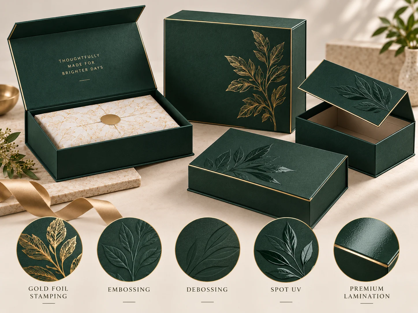
Surface finish, gloss level, the material being printed and lighting can influence perceived color appearance. Review the color requirements alongside the intended finishing, including:
- Matte Lamination
- Gloss Lamination
- Foil Stamping
- Spot UV
- Embossing / Debossing, where relevant to visual presentation
A matte or glossy surface changes how the package is viewed, while foil and raised or recessed details contribute to its visual presentation. Do not assume that an unfinished color preview represents the final finished pack.
For related reading, explore the Printing & Finishing category.
For a closer look at metallic accents and selective gloss, see Foil Stamping vs Spot UV: What’s the Difference?.
8. Why Printed Color May Look Different From a Screen
Screens use emitted light and typically display RGB-based colors. Printed packaging depends on ink, paperboard, coating or lamination, and the lighting conditions in which it is viewed.
For this reason, on-screen appearance should not be treated as an exact prediction of printed output. Discuss the intended material, finish and available color references when reviewing the design.
The same planning principle applies to Folding Cartons and Rigid Boxes: evaluate color on the surface and construction intended for the project.
9. What Should You Provide for a Packaging Project?
Prepare the information you have available:
- source artwork
- CMYK values where applicable
- Pantone references where applicable
- brand guidelines
- finishing requirements
- a physical color reference, if available
- information about the packaging material and structure
Identify which elements have specific color requirements and which details are still open for discussion. For file preparation guidance, see Artwork Requirements for Custom Printed Packaging.
10. Which Should You Choose?
CMYK may be appropriate for full-color artwork, photographs and complex graphics. Pantone may be considered for specified brand colors, solid spot-color elements or projects needing a standardized color reference. Some projects may use both.
CMYK and Pantone serve different color requirements. The suitable approach depends on artwork, brand-color needs, printing method and project requirements.
Confirm the final approach during artwork and production review, together with the material and finishing requirements.